a better experience with every touch
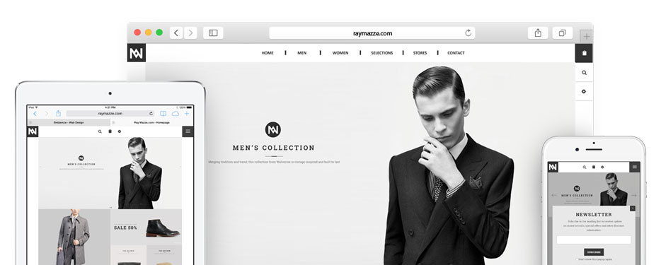
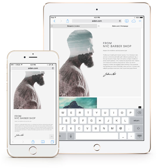
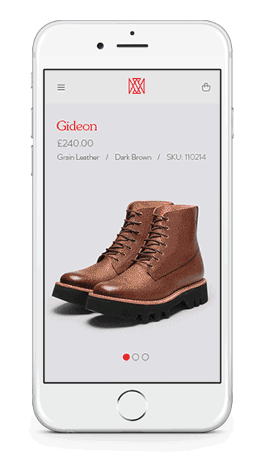
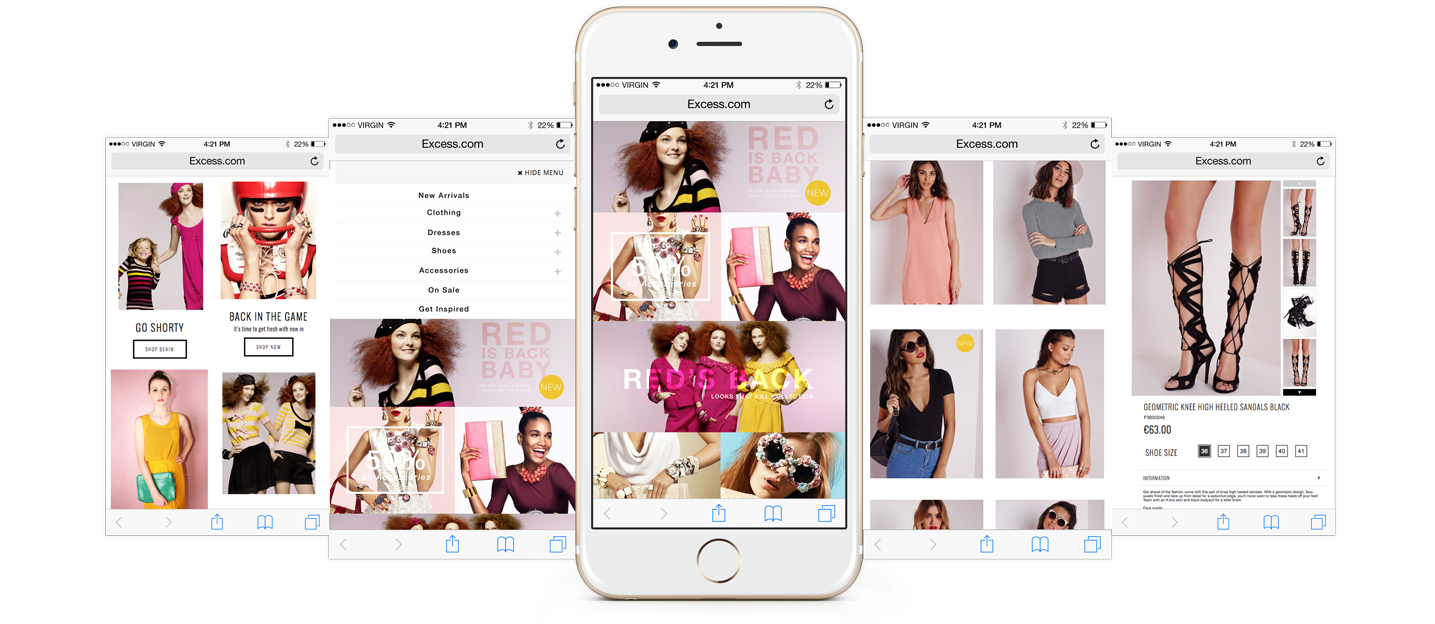
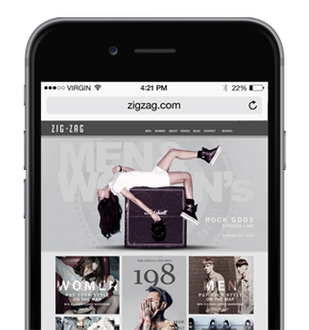
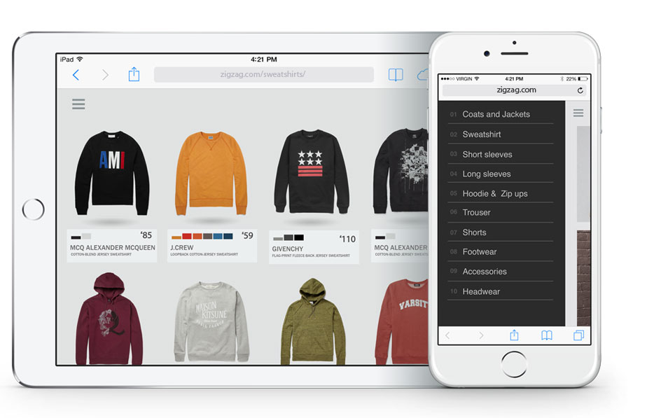
A Responsive Web Design dynamically re-sizes its content and imagery, to ensure the website is effective and easy to use on any device and any screen size.
design
focus
Navigation
lift off
design
The responsive web design allows for a single website to adapt to all devices whether a desktop, smartphone, or tablet, the design will reform shape and size to meet measure.
direct
easy nav
clean
focus content viewing
A responsive web design dynamically re-sizes its content and imagery for a variety of different screen sizes in order to ensure the website is effective and easy to use on any device.
unfocus content
focus content
mobile navigation
Emblem designs are tested across all popular web browsers, insuring a successful display across various browsers, platforms, and resolutions. That way your users will always receive a positive, user-friendly experience.
Simplistic
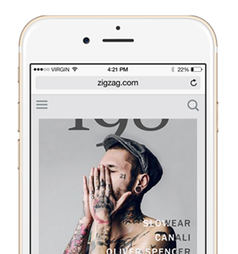
Responsive web design is equipped with a unique Touch friendly navigation, that allows users to navigate proficiently without any drag or disruptionLook and feel
The navigation is so effective that users feel that they are running a app, and not a website on a browserflexibly
Responsive nav is more organised and flexible. Grids are fluid, images flexible, and style rules are defined that take maximum advantage of whatever screen real estate is available.Mobile web usage is growing at an extremely rapid rate. A website that is not optimised for mobile responsive web design performance stands to lose potential consumers, as they will leave if the site is not easily acceptable. Our professional responsive designs deliver outstanding results from both desktop and mobile users.
we have lift off
Responsive web design is the best course of action when it comes to making your website both mobile and search engine friendly. By providing a single, dynamic version of your website’s design to both desktop and mobile visitors, you make it more accessible to your user’s as well as making it easier for search engines to understand your content.
Click Here to view some great responsive design examples